
Unifying apps across a merger
$860M
OpenText acquisition, Nov 2021
21%
ARR increase post-launch
~40k
net new users
4
sotwares merged
The business problem
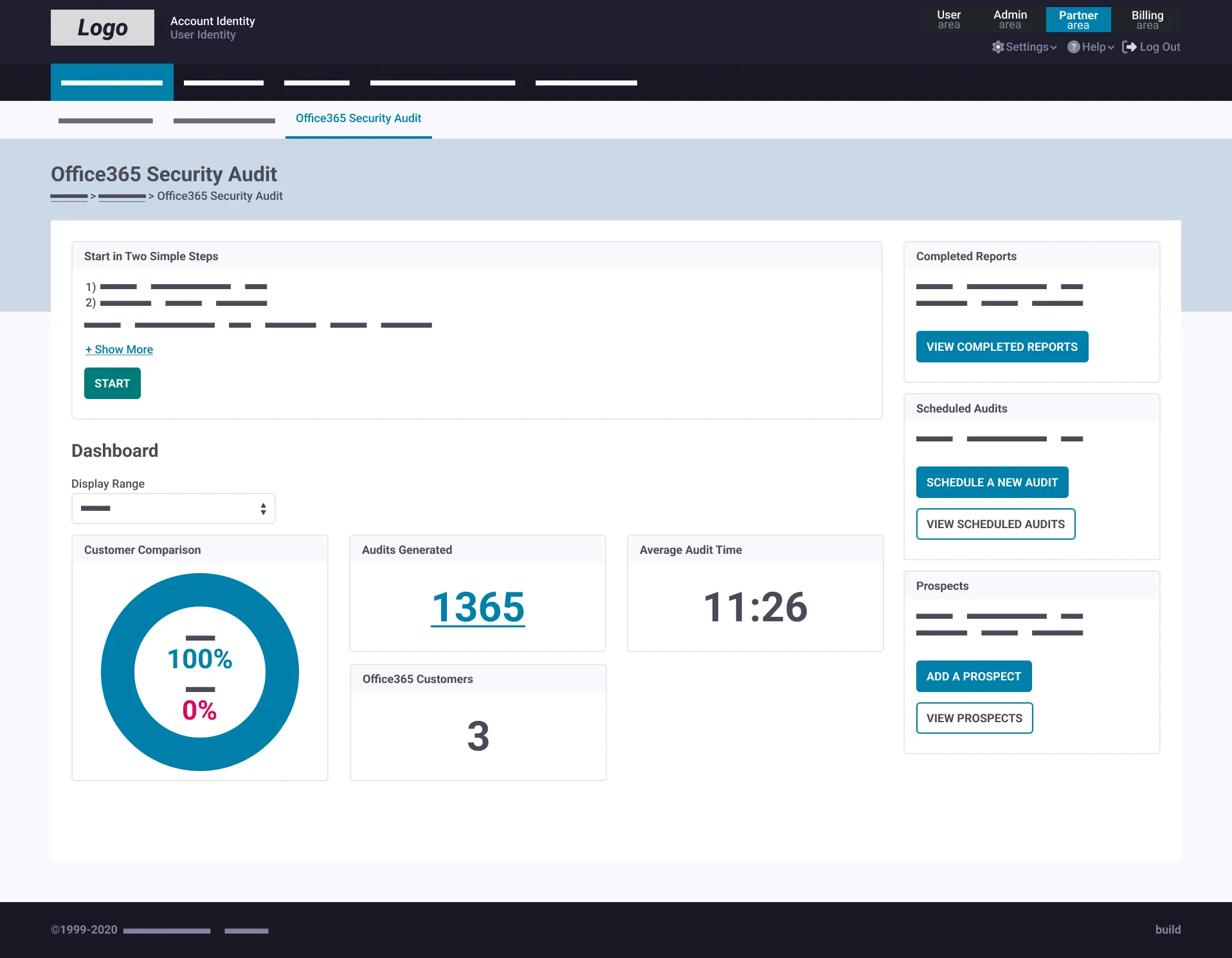
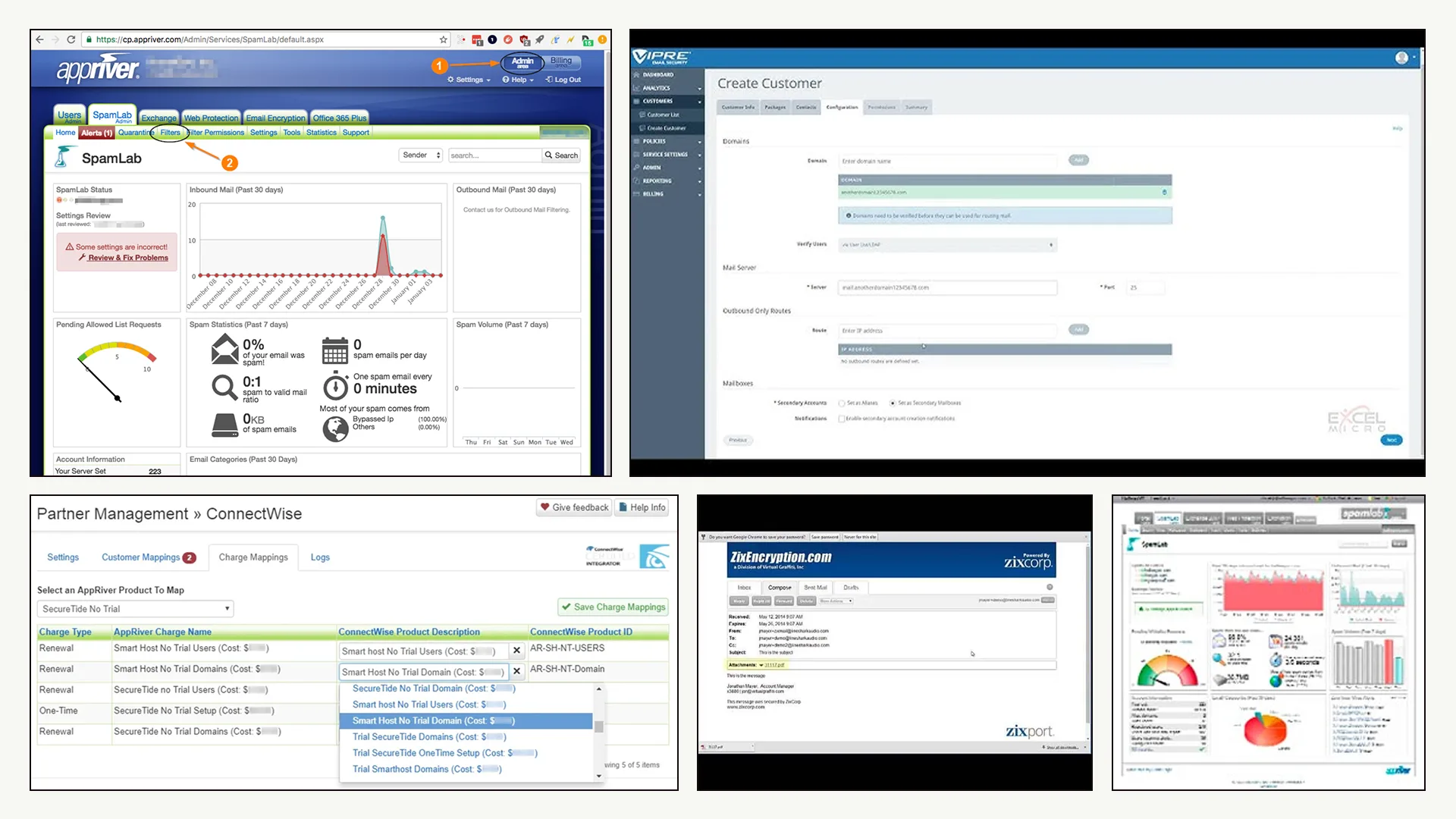
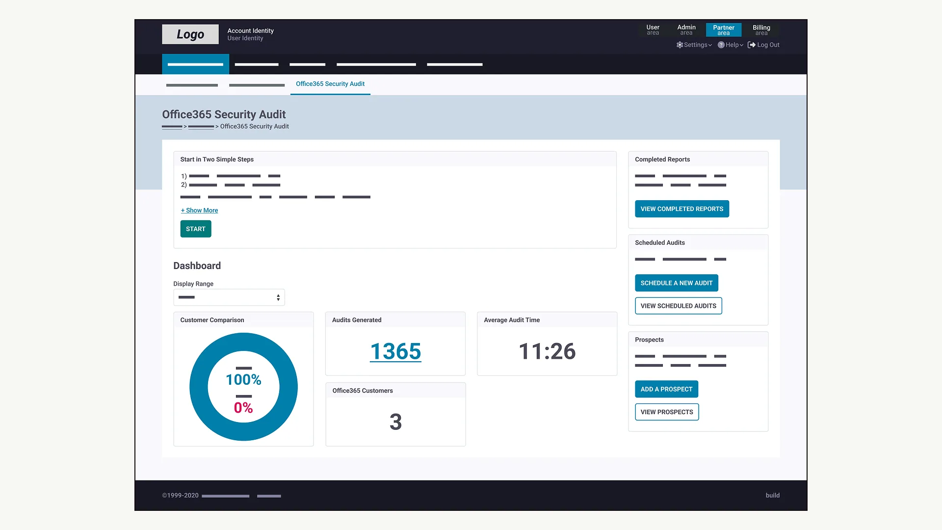
Zix was operating separate softwares, neither of them sharing a design language, interaction patterns, or information architecture.
For enterprise buyers, this is a problem. A CISO or IT director sees integration risks, training overhead, and evidence of organizational fragmentation. A unified product signals maturity and reduces perceived vendor risk. A fragmented one raises it.
Product showcase
The brief: audit the product surface, establish a governed design system, and unify the experience across apps—without halting product development or triggering a full rebuild.
Research
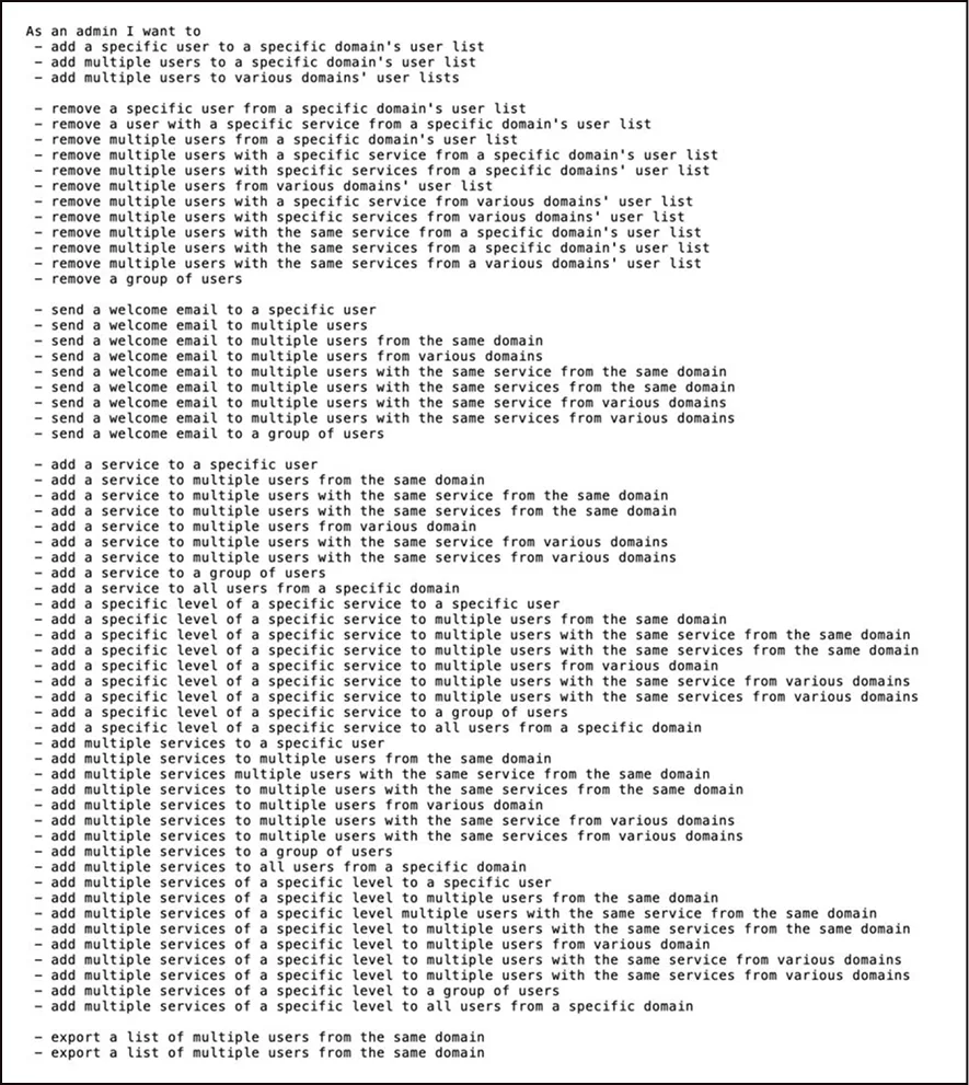
Audit
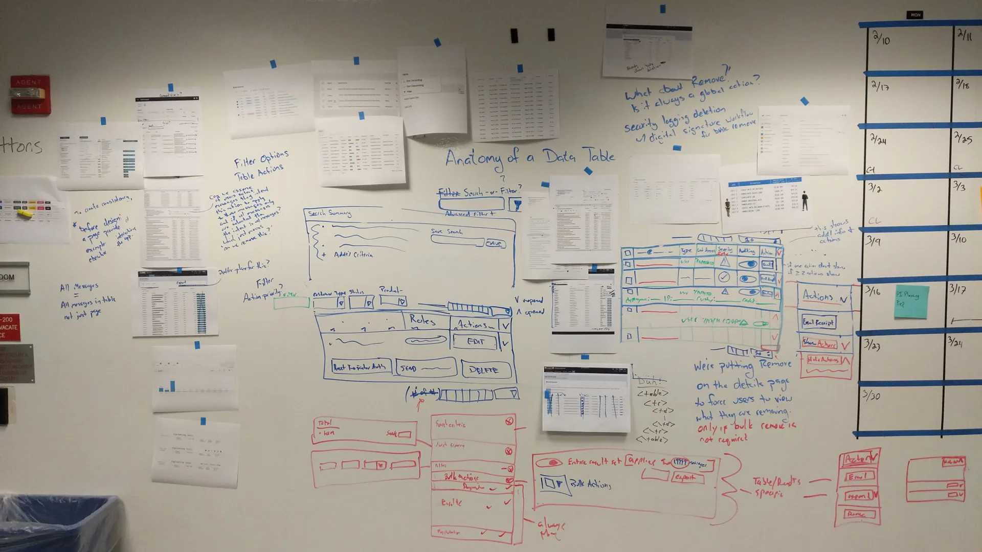
Patterns
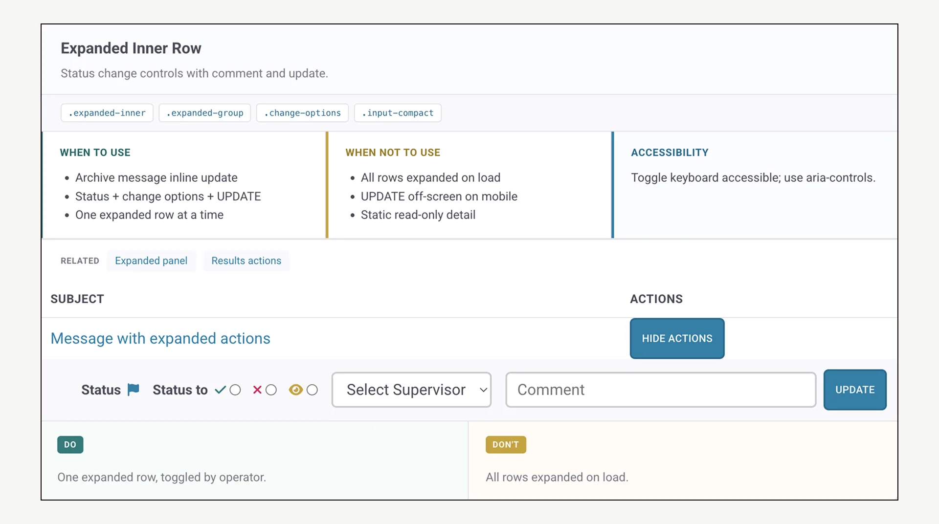
System
What I owned
I was the sole hands-on designer.
The UX Director provided strategic oversight; execution was mine. I owned the audit and research methodology, the design system end-to-end, and all interaction design across the engagement. The ratio of UX to engineering at Zix was approximately 70:1. That constraint shaped every decision I made about how to work.
Understanding the problem
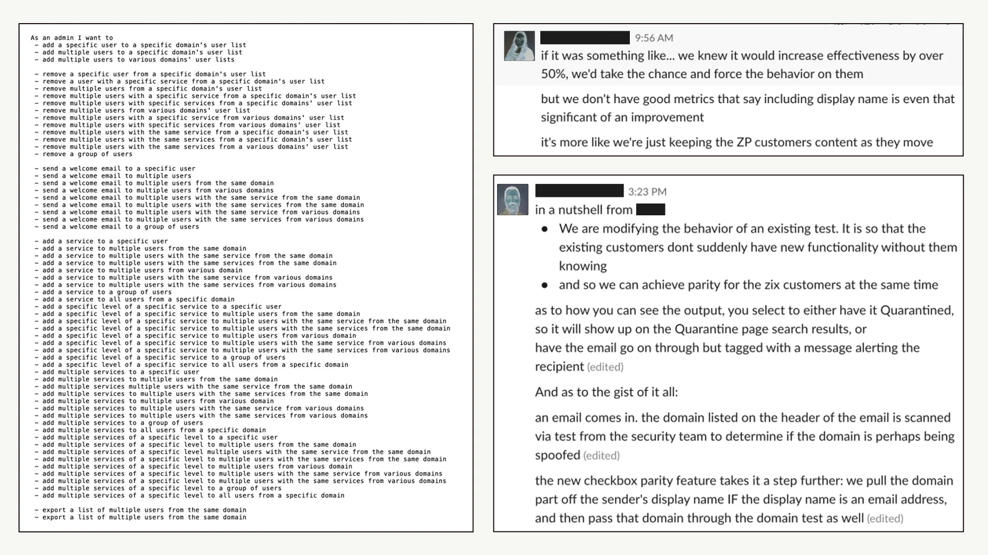
I conducted a Top Tasks analysis across the product suite.
My work identified the most critical functions users performed, mapped them to existing workflows, and validated which tasks recurred across multiple apps. The finding that mattered most: the same tasks were being accomplished in structurally different ways depending on which app a user was in.
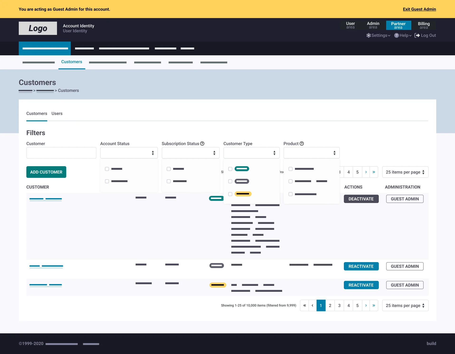
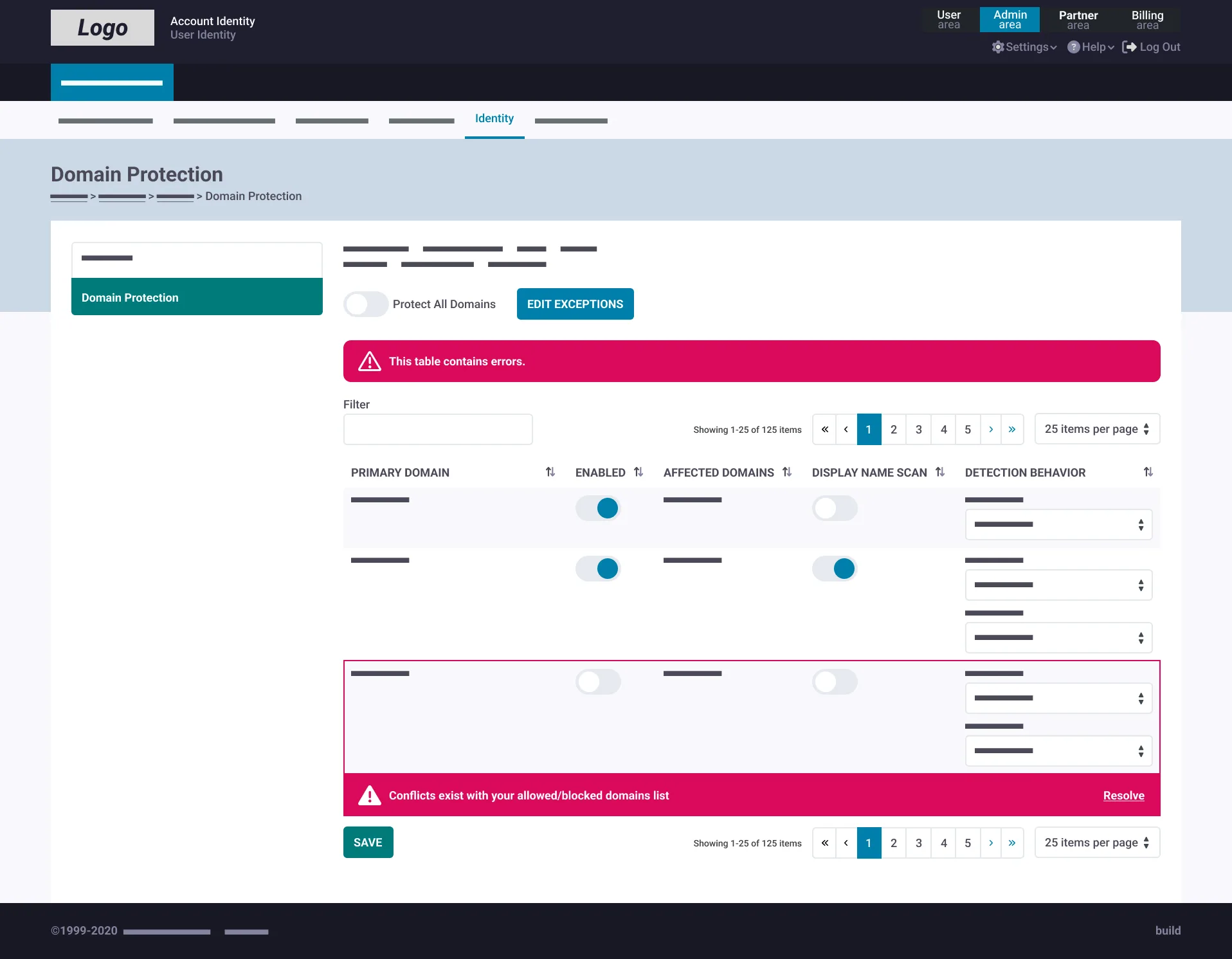
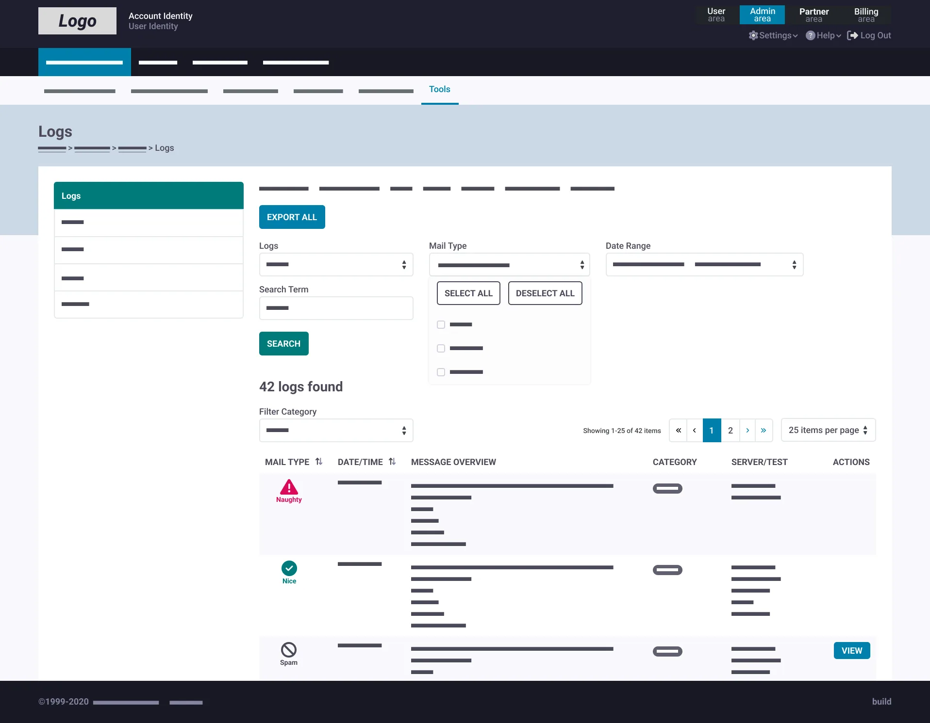
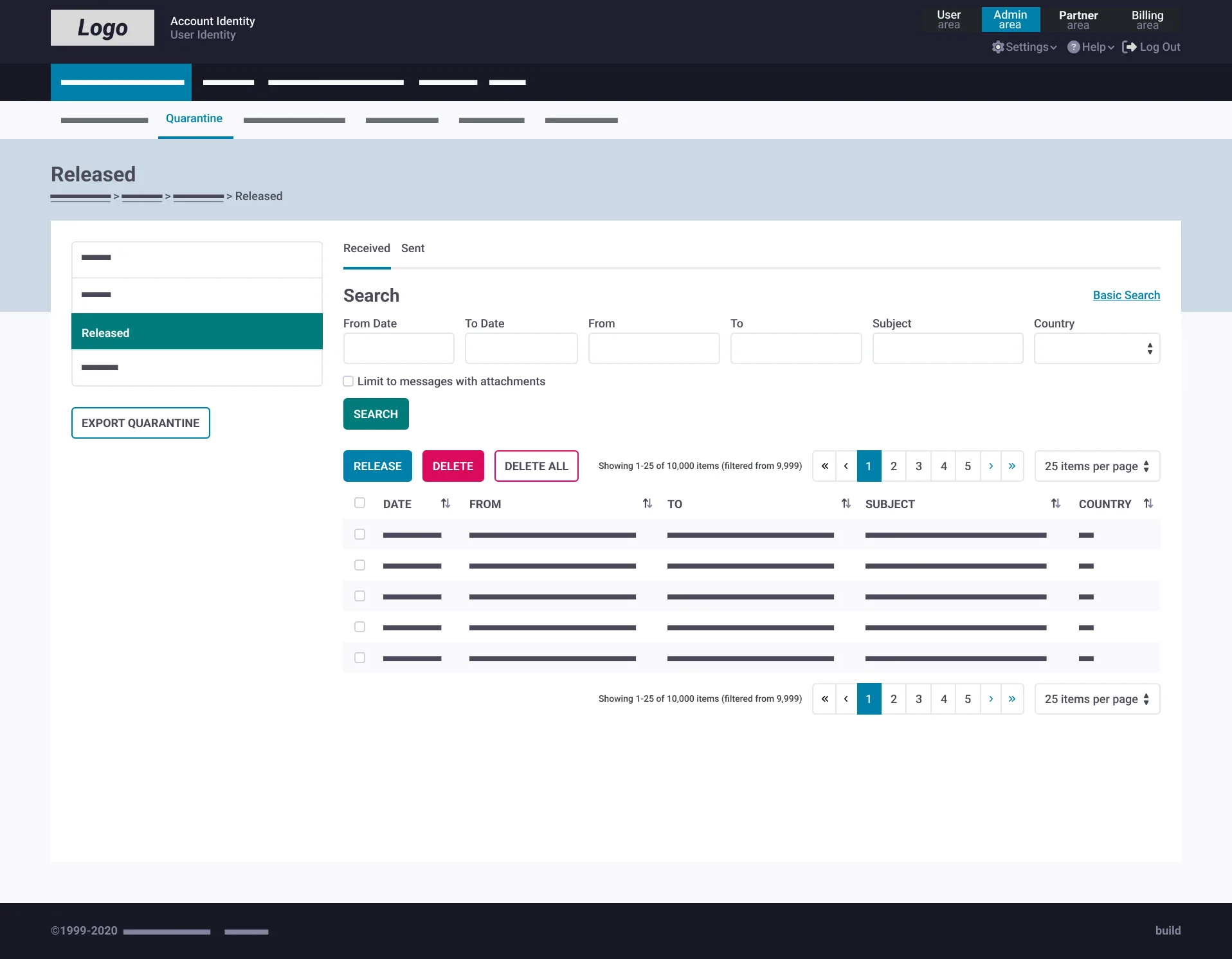
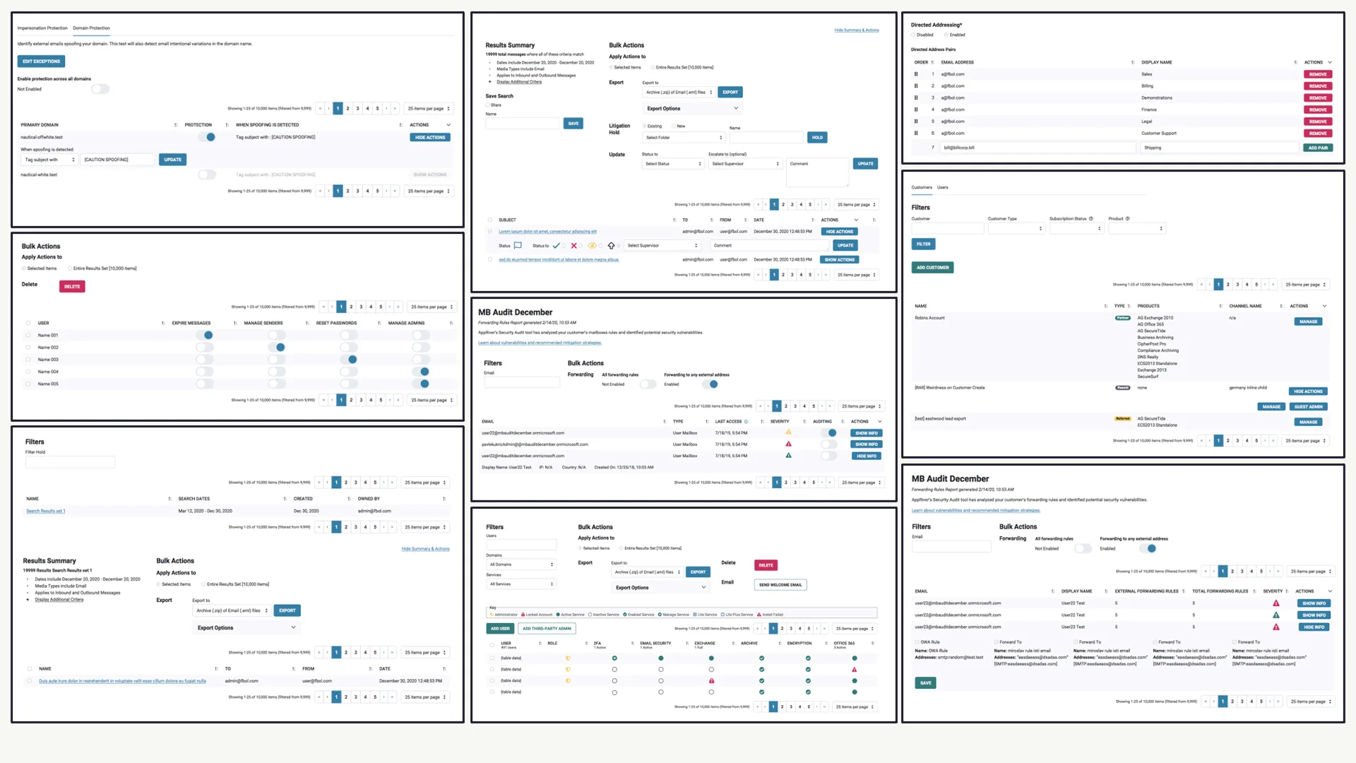
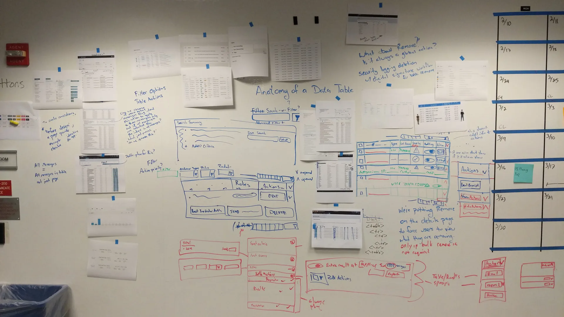
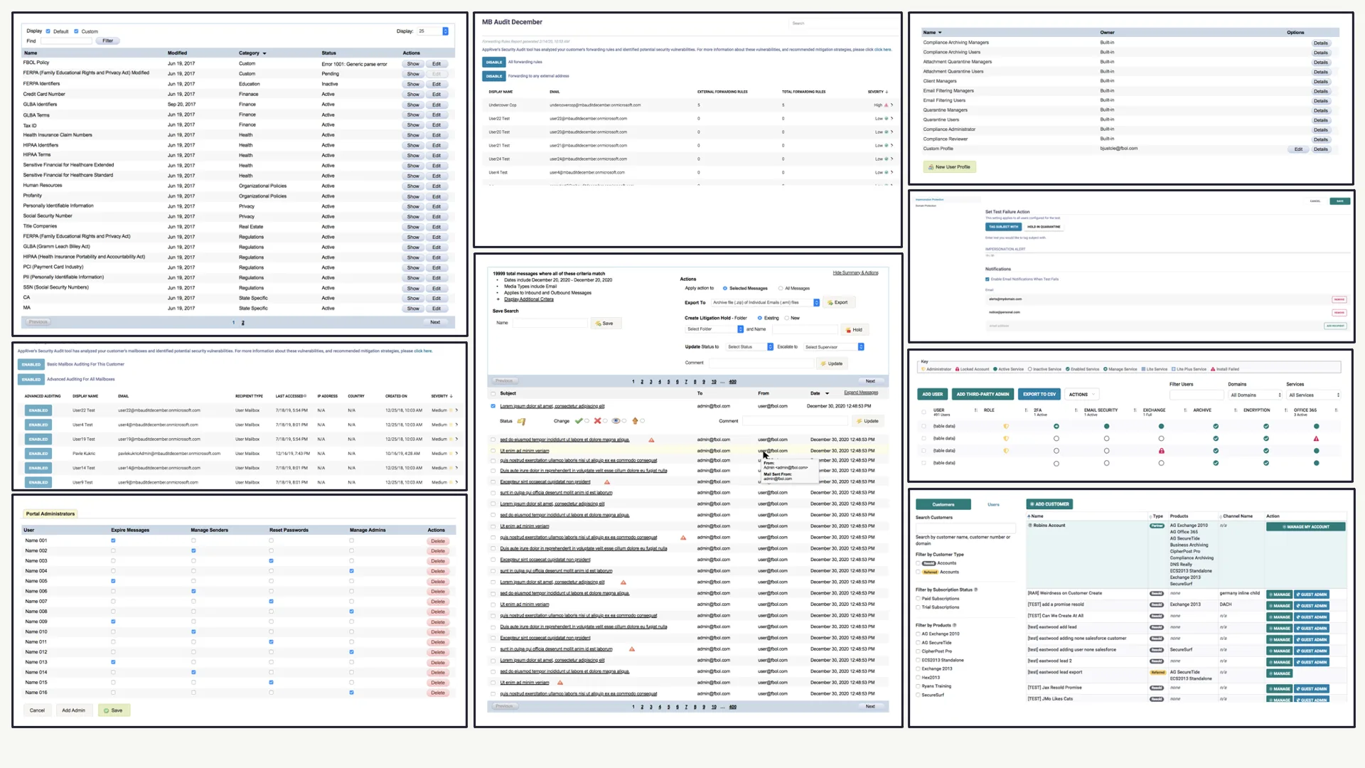
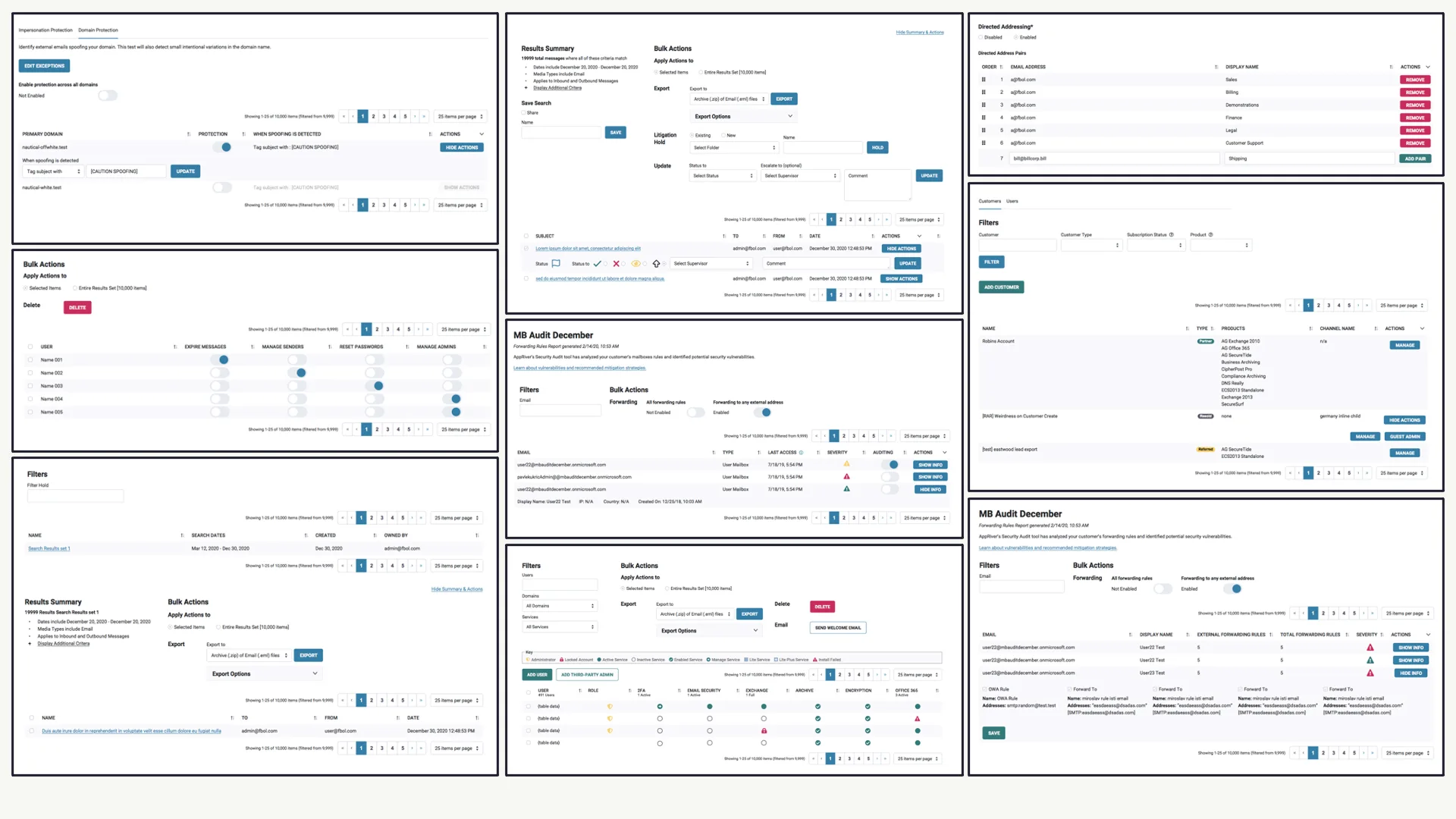
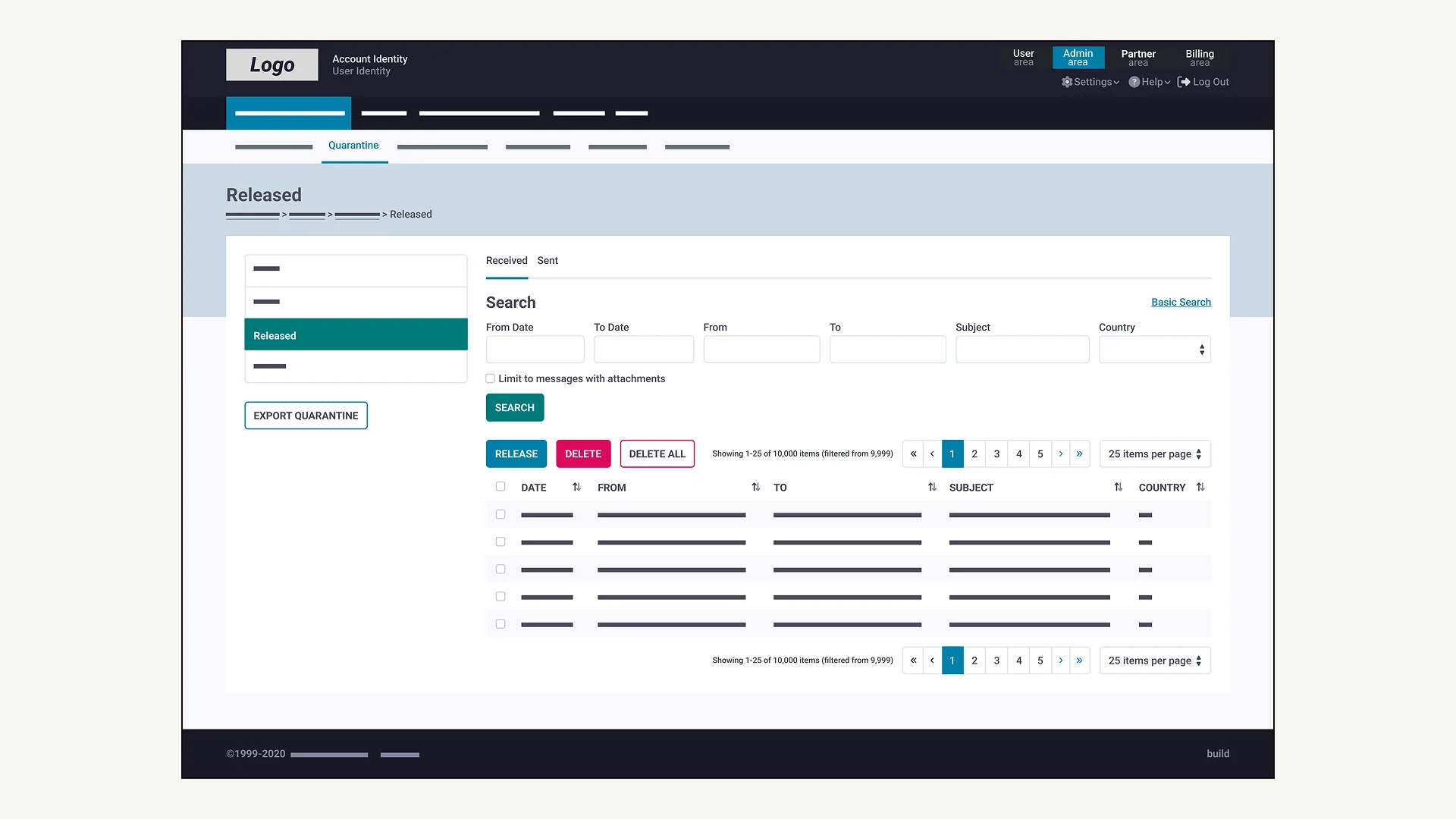
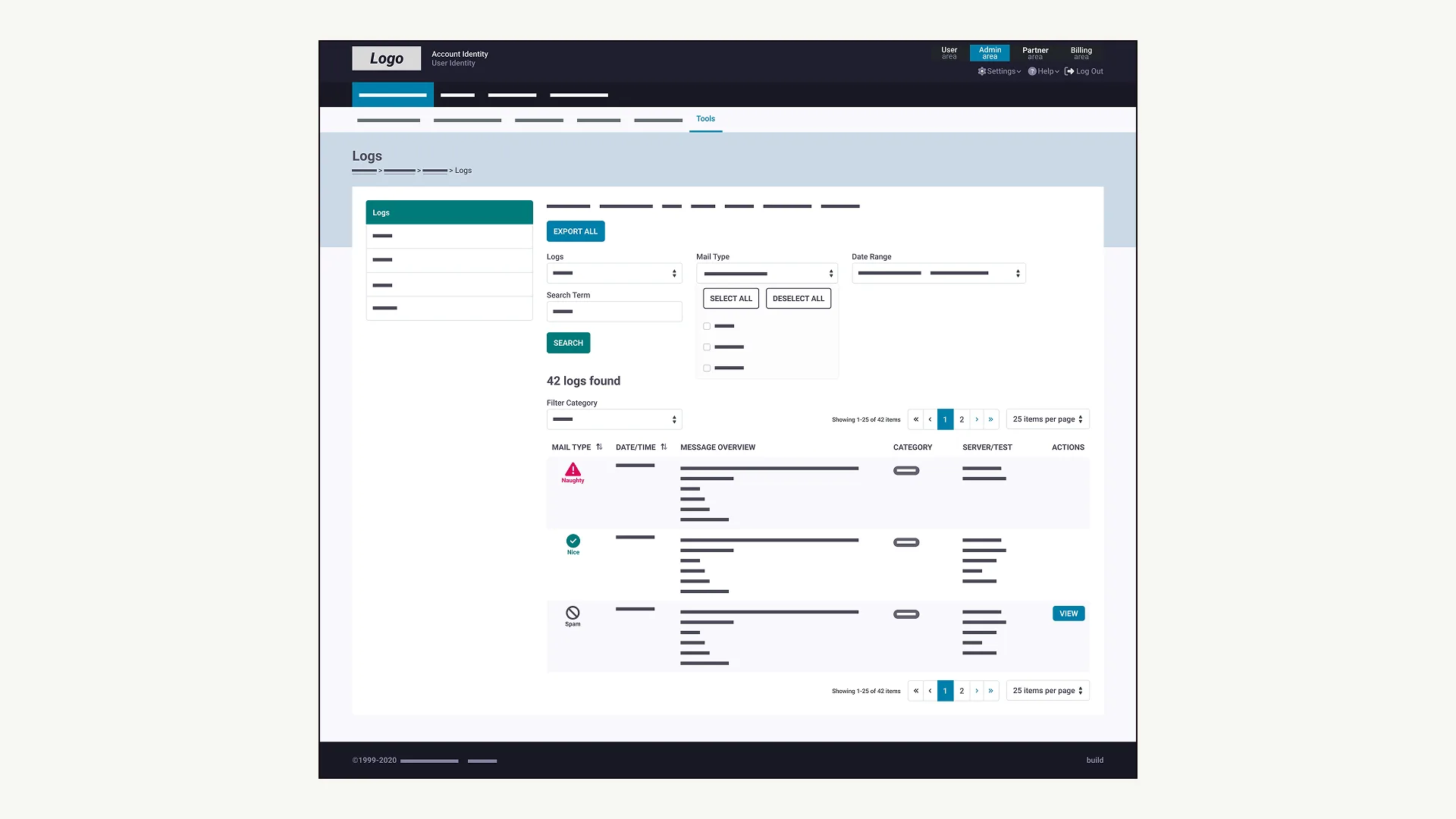
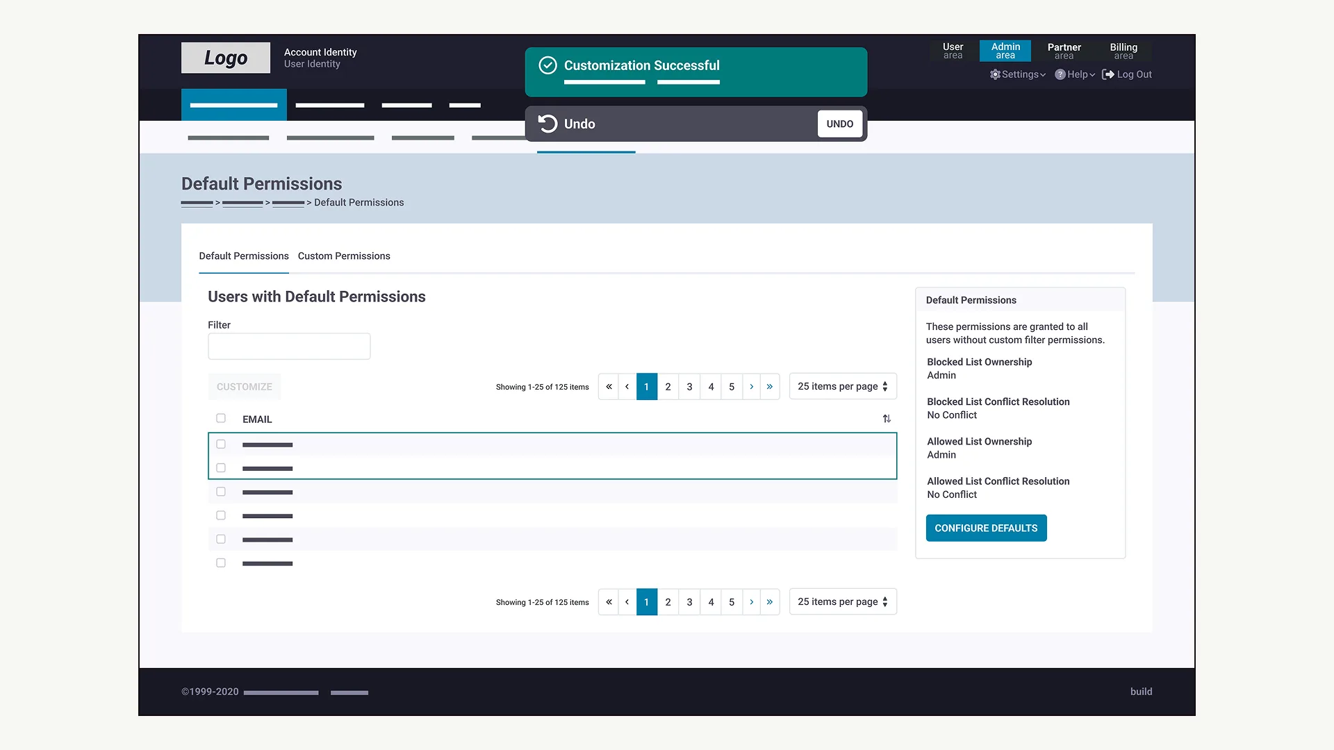
I also ran an extensive audit of design patterns across all 21 applications. The dominant interaction pattern, by a wide margin, was the table. But every team had implemented tables differently — different column structures, sort behaviors, action patterns, and visual treatment. The audit made the scope undeniable.
The three decisions that mattered
Scale influence, not control.
At a 70:1 designer-to-engineer ratio, the instinct to own every UX decision is a trap. I educated and empowered engineering teams to build correctly — documentation, making the right choice the easy choice, and trusted advisor relationships. The design system was a transfer of design judgment at scale.
Don't redesign everything at once.
I structured incremental unification: audit patterns, govern high-frequency interactions first (tables, forms, dashboards), then roll out across apps in priority order — always something concrete to ship.
Work with the table pattern, not against it.
I standardized and elevated the table pattern instead of replacing it. Consistent sort/filter, readable spacing, accessible targets — the existing paradigm done correctly and consistently everywhere.
Design system
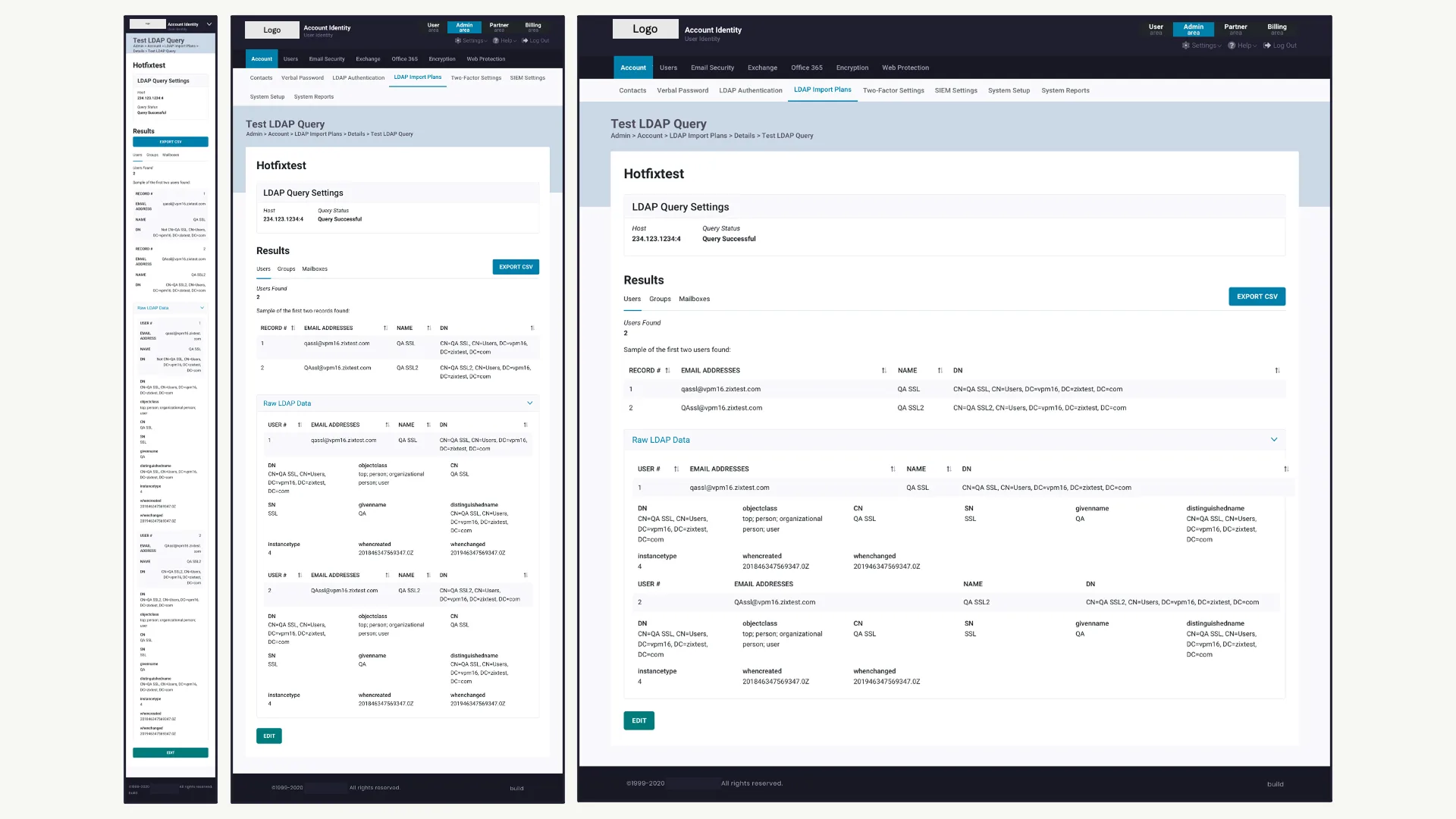
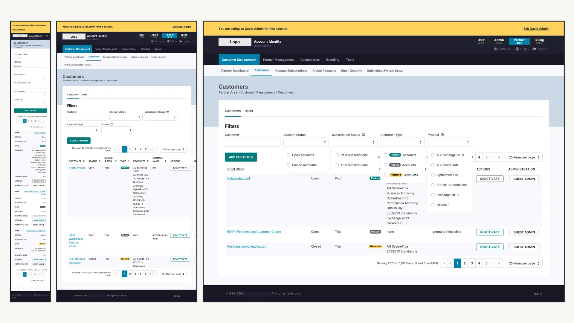
The design system in practice.
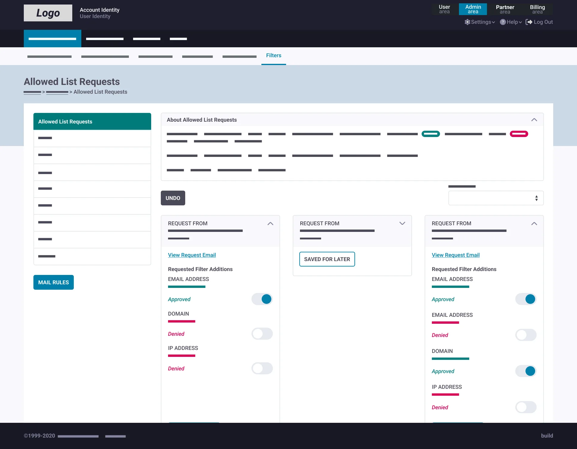
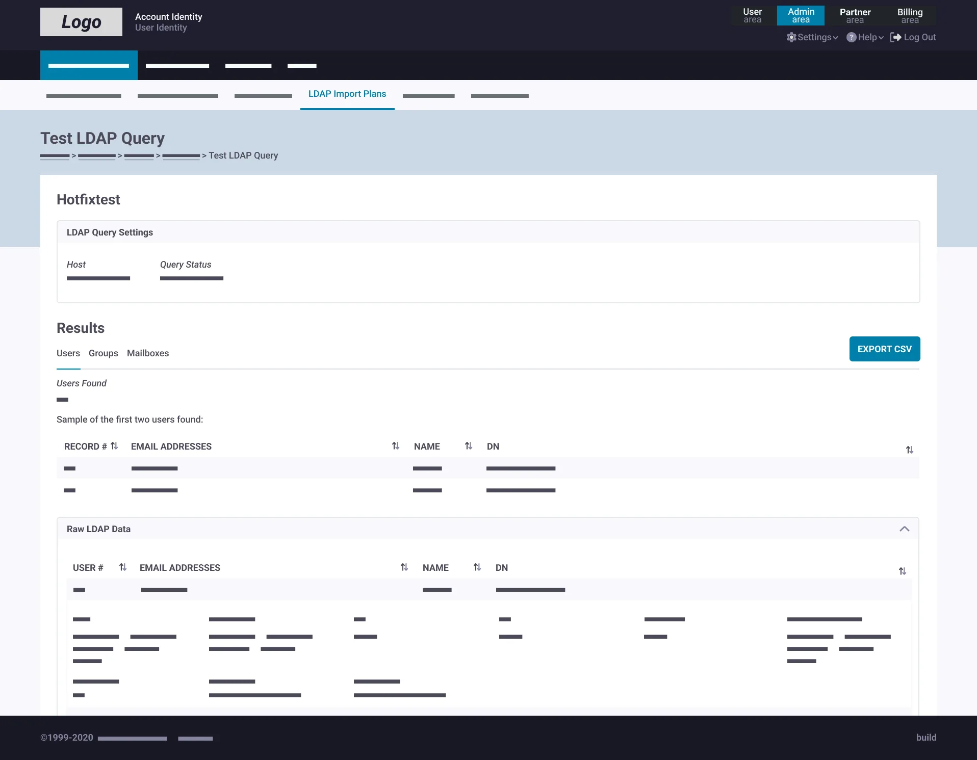
The system was built on Abstract + Sketch, with a single source of truth linked directly to engineering handoffs. Developers accessed the latest version at all times — no stale exports, no "which file is current" conversations.
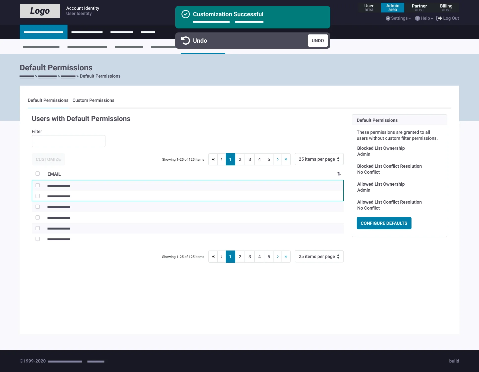
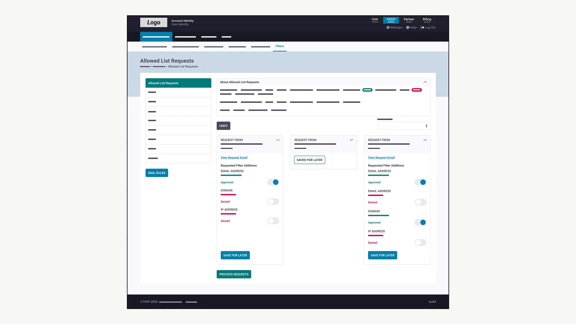
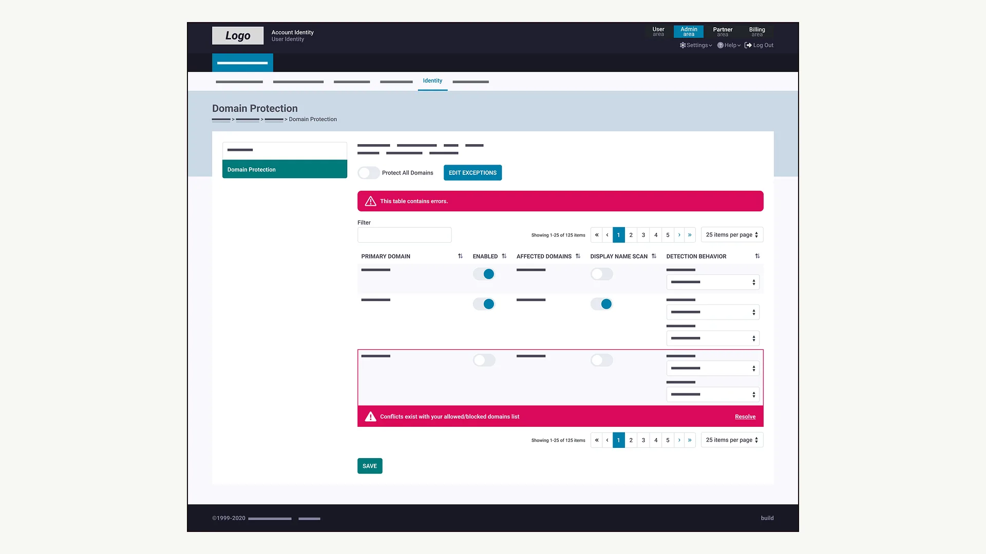
Prototypes were built against requirements, tested, and refined until releasable. Edge cases and failure states were system components — success messages, undo actions, and clear error states — not afterthoughts.
Accessibility was addressed systematically: larger interaction targets, increased spacing, and simplified flows were properties of the system.
Browse the pattern gallery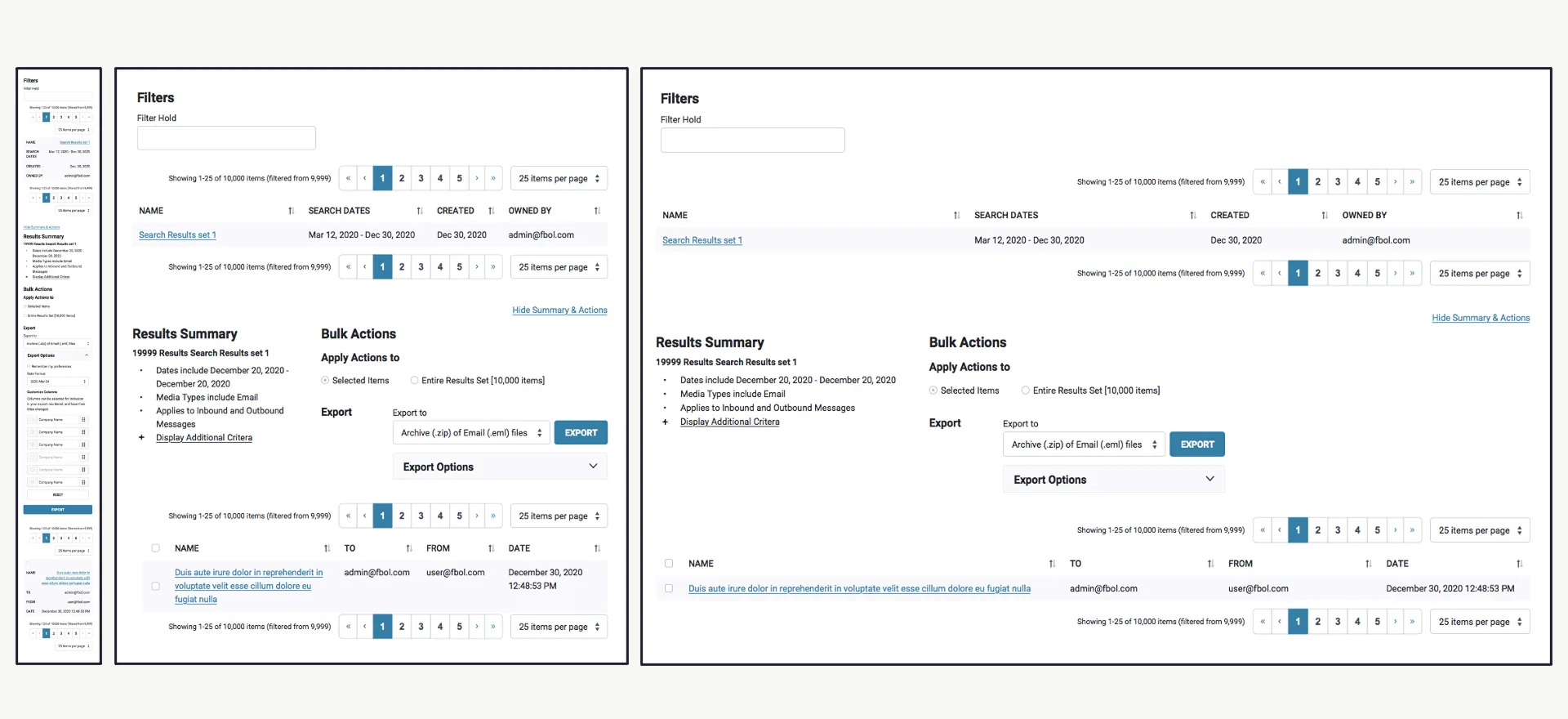
Results
“At first [this software] was annoying to use, but in recent years they've made it much easier to deal with.”
Customer review Zix product user
In November 2021, OpenText acquired Zix for $860 million. In the year following the design system launch, Zix's ARR increased 21% per SEC filings, with approximately 40,000 net new users.
Your rivals expect you to sleep on your UX. They thrive on what you ignore. Prove them wrong
Next project
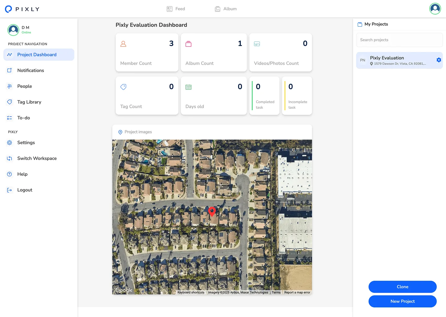
3 weeks. 1 AI POC. Kiewit.
AI vision for construction photos
$1M+ pipeline
Keep scrolling
Continue to Pixly